The project is under NDA, so no details of the designs can be presented here.
Challenges Encountered
Developing a design system within a complex organizational and technical environment came with unique challenges. Balancing critical priorities such as security, usability, and stakeholder alignment required thoughtful approaches to ensure the system’s success.
Challenge #1
Balancing Security Requirements with Usability
Designing in a security-critical context required strict adherence to protocols, which often conflicted with creating seamless and intuitive user experiences.
Challenge #2
Aligning Diverse Stakeholder Expectations
Different teams had varying priorities, such as branding, development feasibility, and user needs, making alignment a challenge.
Approaches to Overcome Challenges
6 Stakeholders
User Storys to structure the needs
Bringing together current problems
Approache #1
Collaborative Workshops
To address conflicting stakeholder expectations, I organized internal workshops to foster collaboration and ensure all voices were heard.
This approach helped to define a shared vision for the design system and create a roadmap that aligned technical, branding, and usability goals.
Approache #2
Engaging Users
To ensure a user-centered approach, I conducted interviews with end-users and stakeholders.
I analyzed user workflows and pain points, gathered insights into their behaviors and preferences, and identified key usability challenges in existing systems.
Approache #3
Analyzing the Tech Stack
The technology stack was analyzed to ensure compatibility and scalability, aligning the system with Angular for seamless integration, leveraging Revvity for UI consistency, and optimizing existing resources.
The design system was developed in strict adherence to the organization’s branding standards and accessibility requirements, ensuring alignment with the company’s visual identity and broader goals through stakeholder feedback. Additionally, the critical nature of the projects required compliance with security protocols and industry standards, with components designed for clarity and usability to minimize user errors in high-stakes workflows.
Realisation
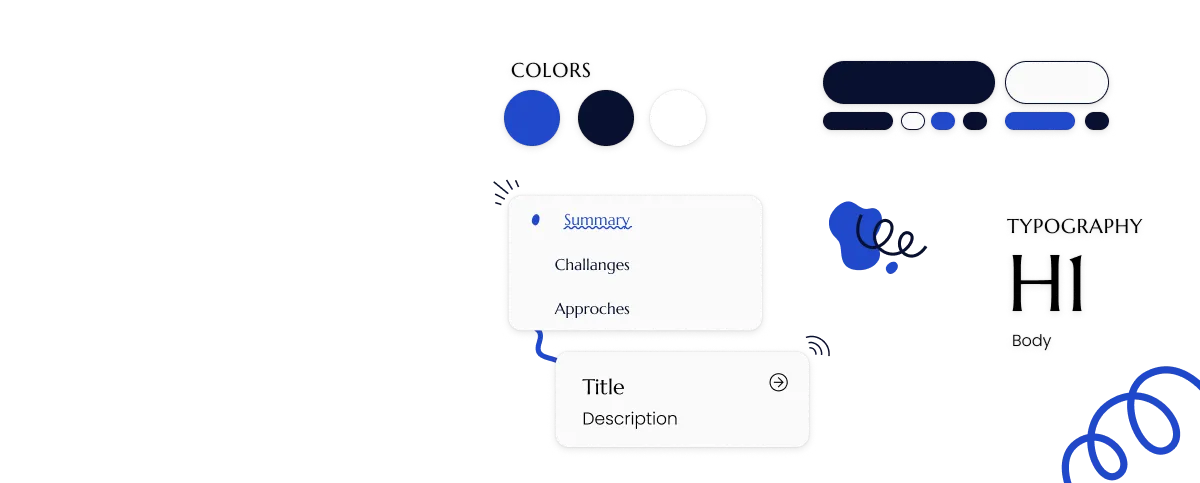
The design system was implemented in Figma using a modular, component-based structure to ensure reusability and consistency. Detailed guidelines and use cases were documented to guide implementation, alongside a comprehensive style guide defining typography, colors, spacing, and interaction patterns.
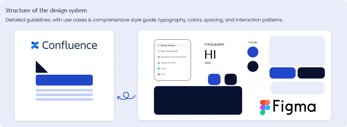
The style guide is organised as follows:
- Chapter 1 covers the basic elements of the application, including typography, colour palettes and shading.
- Chapter 2 covers the use of logos and icons in the application.
- Chapter 3 covers the basic components and elements used in the application, including buttons.
- Chapter 4 covers the navigation and hierarchies of the application, including the click paths and user flows.
Key Learnings
Key achievements included the effective introduction of UX/UI principles, enhanced usability and design consistency through actionable recommendations, and successful support for interdisciplinary teams through collaboration and clear communication.
Learning #1
Successfully integrating UX/UI into development processes requires close collaboration among design, development, and stakeholder teams
Learning #2
Workshops and stakeholder interviews are critical tools for understanding user needs and driving user-centered solutions.
Learning #3
Usability evaluations are vital for identifying improvement opportunities in internal and external software.